Hey,
Today we worked independently and researched some thriller movie title pages. This was to get some inspiration for our own openings. Here are some that I found and that were my favourite;
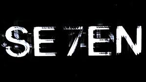
The blurry effect on the title adds a mystery to the title and makes the audience think about what the word and number 7 means. They also incorporate the number into the word as well but it is still readable and understandable. It makes the title intriguing.
With this title the use of blood adds the stereotypical thriller feel, of death, gore and suspense It also adds a question to the watchers mind as they will wonder why and how the blood is there. The title itself also brings up questions of what does force mean and what does it symbolise?
The final font we looked at was the title page from The Butterfly effect. The editors have cleverly created a title where an image of a brain is in the background with a butterfly (linking to the title) overlaying it and the title in white, this helps make it stand out against the blue and black background. The brain helps foreshadow that the main character or the storyline in the movie is about someones mental state (because of the brain). The font being bold also catches the eye which is important within a movie title.
For our own font research I looked at DaFont, a font website that has many different fonts, colours and sizes on offer. Here are some of the fonts that I specifically like as an idea for our thriller.
All these titles are stereotypical thriller Titles/fonts, but I really liked the look of them all and we are hopefully going to consider using them.


No comments:
Post a Comment